Want to avoid crash acccident - Don't go to high-crime neighborhoods
My approach
The goal for the second project is to analysis and predict the number of car accidents in the city of Chicago, taking into account of multiple variables such as crime rate, weather, accident location , driving conditions, population density, traffic density and road condition.
Table of content
Packages:
Pandas: for data framesSeaborn: for statistical data visualizationStatsmodels: for statistical models, and perform statistical testsScikit-learn: for machine learning libraryScipy: for mathematical functions.dbfread: for reading DBF files and returning the data as native Python data typesShapely: for manipulation and analysis of planar geometric objectsFolium: for interactive map
Get the data
Now that we know what we want to predict, what are the inputs? What could cause a car crash. There are many factors, some of which I include in this analysis.
-
Weather (temperature, wind speed, visibility, rainy/snowy/icy, snow depth, rain depth, etc)
-
Time features: hour of day, day of the week, month of the year.
-
Static features such as number of intersection , speed limit, average traffic volumes, etc
-
Human factors such as population density, etc
-
Countless others
The city of Chicago publishes those dataset that are worth exploring:
I find the vehicle accidents to be strongly related to location (Geography), so I will grab the Geojson file, so that I can perform geographic data analysis and aggregate the data at zipcode level and month level.
Handling with spatial data to geoinference the zipcode
I utilized dataset from OSMnx Street Networks Dataverse - U.S. Street Network Shapefiles, Node/Edge Lists, and GraphML Files which provides the lat/lon coordinates of all crossroads in Chicago. There are total 28372 intersections recorded in Chicago. The next step is to retrieve the zipcode for each crossroad.
Given geoJSON database of Chicago with lots of polygons (census tracts specifically) and intersection coordinates, I did some geoinferencing with Shapely and GeoJSON to identify which census tract and zipcode each intersection belongs to.
step 1. Import all the required libraries
import pandas as pd
import json
from shapely.geometry import shape, Point
step 2. Load the dataset and geoinference the zipcode
# load GeoJSON file containing sectors
with open('./dataset/chicago_boundaries_zipcodes.geojson') as f:
    js = json.load(f)


# load file containing lat/lon coordinate of each intersection
df_intersection = pd_read_csv('./dataset/intersections.csv')

# extract the zipcode from coordinates
zipcode = []
for i in range(len(df_intersection)):

    # construct point based on lon/lat returned by geocoder
    point = Point( df_intersection.iloc[i] ['LONGITUDE'], df_intersection.iloc[i] ['LATITUDE'] )


    # check each polygon to see if it contains the point
    for feature in js['features']:
        polygon = shape(feature['geometry'])
        if polygon.contains(point):
            #print('Found containing polygon:', feature['properties']['zip'])
            zipcode.append(feature['properties']['zip'])
Visualize crash rate with Folium map
chicago_metis = [41.876585, -87.653472]
chicago_map = folium.Map(chicago_metis, zoom_start=10, tiles="Stamen Terrain") #OpenStreetMap , tiles="Stamen Terrain"

# reading of the updated GeoJSON file
chicago_geo = './dataset/chicago_boundaries_zipcodes.geojson'

choropleth = folium.Choropleth(
        geo_data=chicago_geo,
        data=df_crash,
        columns = ['zipcode', 'Number_of_Crash'],
        key_on = 'feature.properties.zip',
        fill_opacity = 0.7,
        line_opacity = 0.2,
        fill_color='BuGn',
        nan_fill_color='blue',
        legend_name=(' ').join('Crash'.split('_')).title() ,
        name='Crash density'
    ).add_to(chicago_map)

folium.LayerControl().add_to(chicago_map)
chicago_map.save('chicago_map.html')
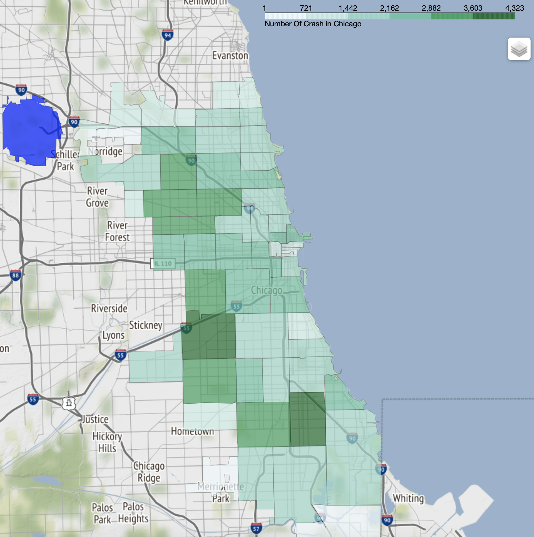
Here is the visualization for rate of car accident:
Exploratory Data Analysis
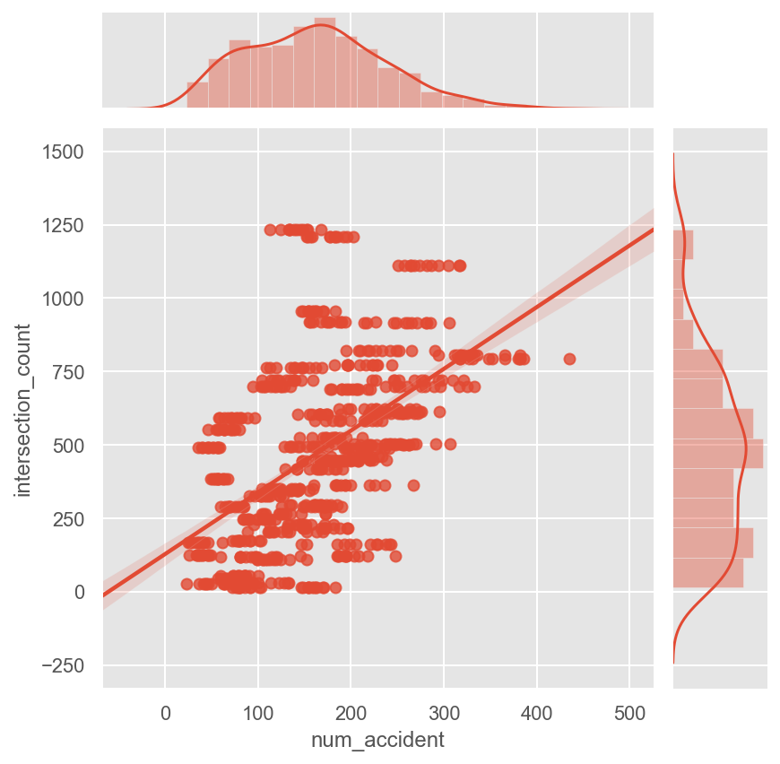
By exploring the data and analyzing the vehicle crash and other factors , we noticed there are some correlations in dataset. At first, let’s check the relationship between number of crossroads and number of accidents
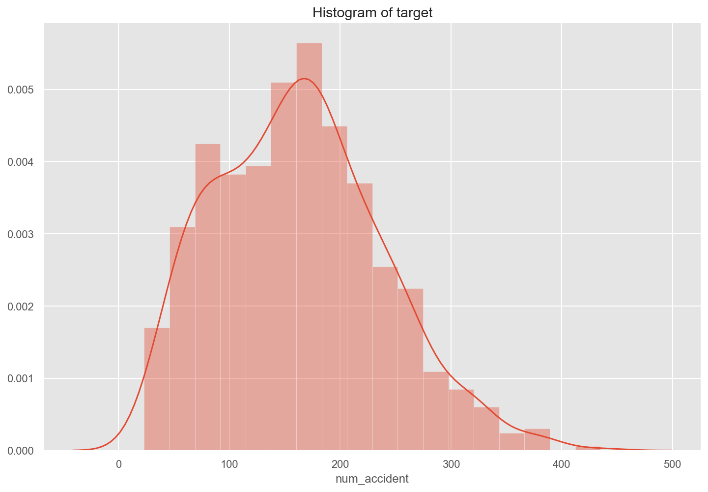
Explore the target data and plot histogram of dependent variable to check if it is normal distribution
plt.figure(figsize=(12, 8))
sns.distplot(df['num_accident'])
plt.title('Histogram of target')
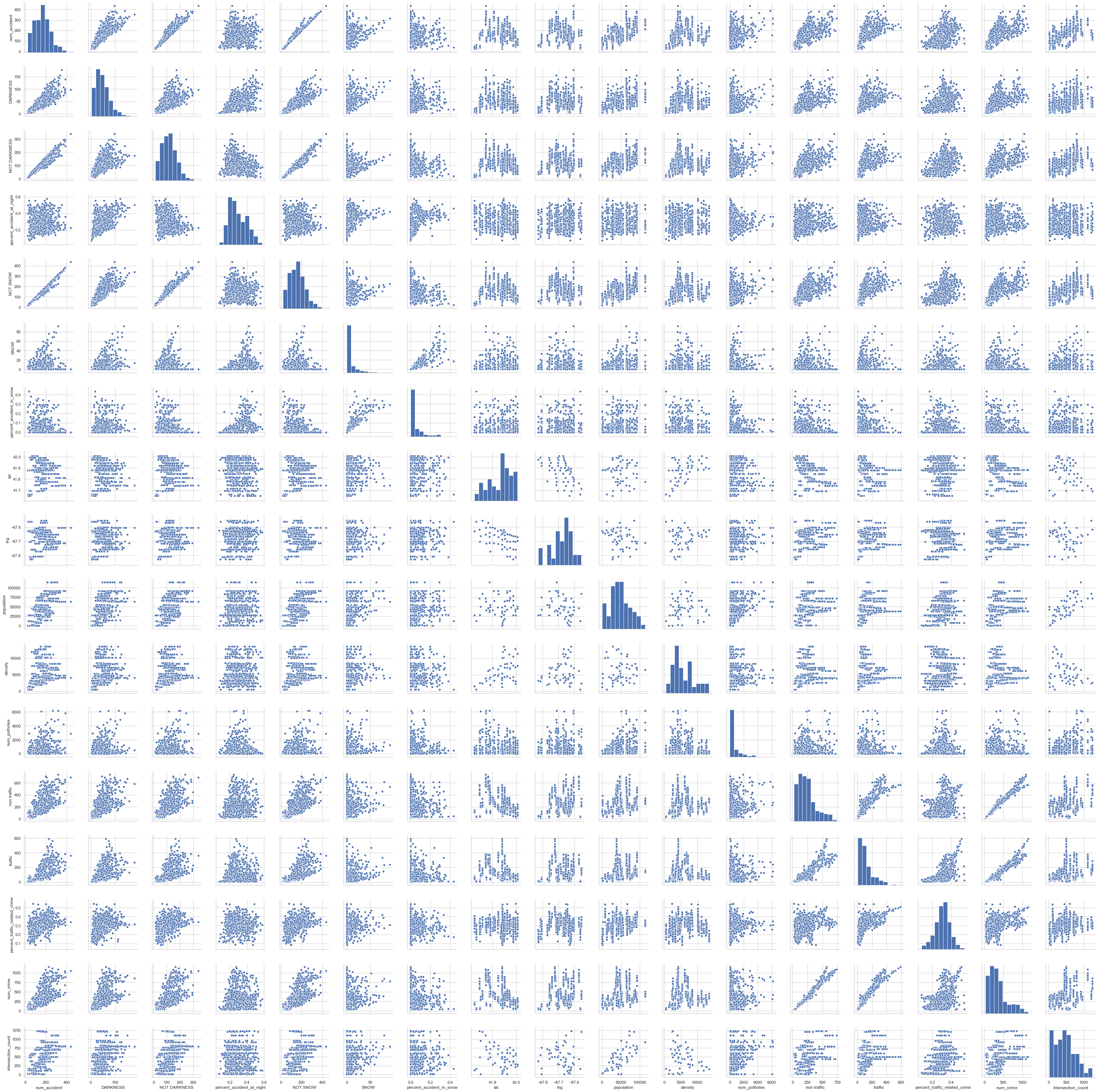
Pairwise scatter plots and correlation heatmap for checking multicollinearity
Visualize Confusion Matrix using Heatmap
Here, I visualize the confusion matrix using Heatmap.
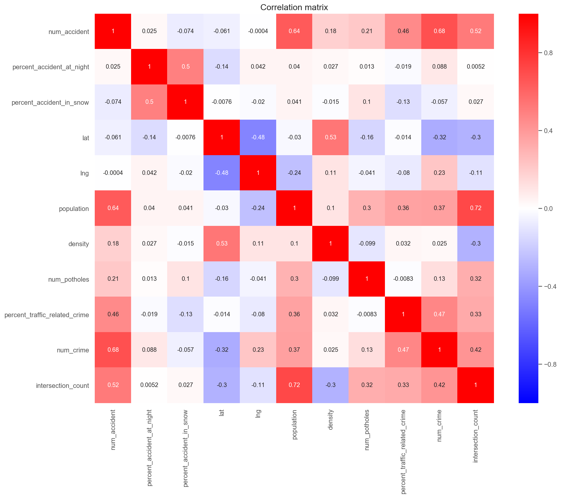
I anticipated there is a strong correlation between condition road and car crash. Contrary to expectations, the crime rate turned out to positively affect the accident rate.
Model selection
Based on the exploratory analysis, here are the features I use as independent variables to fit model :
percent_accident_at_night– percentage of accident at nightpercent_accident_in_snow– percentage of accident in snowlat,lgn– latitude and longitude of each zipcodepopulation– population of zipcode where car accident happensdensity– population density per zipcodenum_potholes– total number of potholes per zipcodepercent_traffic_related_crime– percentage of vehicle-related crimenum_crime– total number of crimes per zipcodeintersection_count– number of intersections in each zipcode
When picking a model to fit the data to there are several factors to consider:
-
What type of problem am I solving? Classification? Predictive?
-
Does only predictive accuracy matter to me or do I want to also understand how the variables effect the model?
For this problem, I am predicting the number of accidents, which is a classic predictive problem. I do want to understand variables’ importance and know how the they effect the model. Ideally, I’d want to tell drivers which area they should avoid and take caution when driving through.
Build linear regression model
 X_train, X_val, y_train, y_val = train_test_split(X, y, test_size=0.2, random_state=42)
lr_model = LinearRegression()
lr_model.fit(X_train, y_train)

train_score = lr_model.score(X_train, y_train)
# score fit model on validation data
val_score = lr_model.score(X_val, y_val)

# report results
print('\nTrain R^2 score was:', train_score)
print('\nValidation R^2 score was:', val_score)
Here is the $R^2$ score :
Train $`R^2`$ score was: 0.6717622381724969
Validation $`R^2`$ score was: 0.6752109416359127
Let’s do some feature engineering to improve $R^2$
X2 = X.copy()
X2['population2'] = X2['population'] ** 2
X2['num_crime_/_num_intersection'] = X2['num_crime'] / X2['intersection_count']
X2['intersection_count5'] = X2['intersection_count'] ** 5
X2['num_crime_x_num_pothole'] = X2['num_crime'] * X2['num_potholes']
Also let’s check the accuracy of the model again.
Train $`R^2`$ score was: 0.7465677013645713
Validation $`R^2`$ score was: 0.7505576728834923
Surprisingly, $R^2$ score improved significantly which is considered quite good.
I also fitted polynomial model with data and the result is much better
Degree 2 polynomial regression val $`R^2`$: 0.814
Degree 2 polynomial regression test $`R^2`$: 0.812
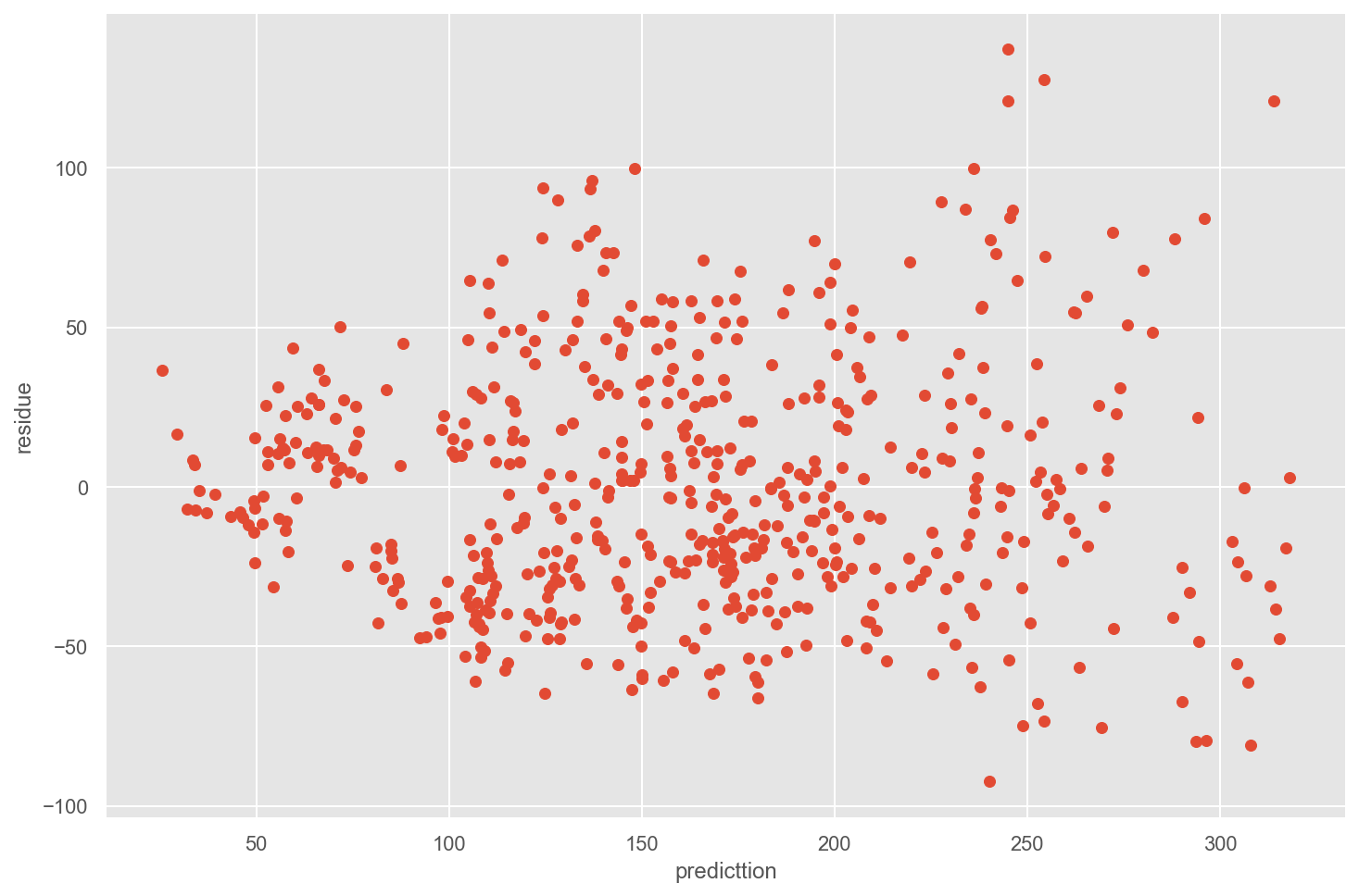
Check the quality of regression model by plotting residual and prediction
Plot of prediction vs. residuals helps to check homoscedasticity. When we plot the prediction vs. the residuals, we clearly observe that the variance of the residuals are distributed uniformly randomly around the zero x-axes and do not form specific clusters. Therefore, it respects homoscedasticity.
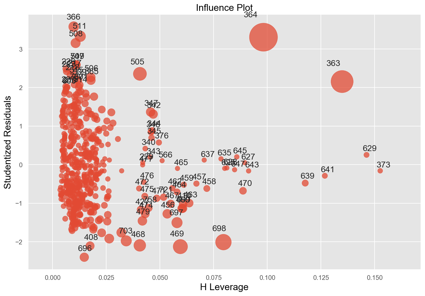
Plot Cooks Distance to detect outliers
fig, ax = plt.subplots(figsize=(12,8))
fig = sm.graphics.influence_plot(model_2_fit, alpha  = 0.05, ax = ax, criterion="cooks")
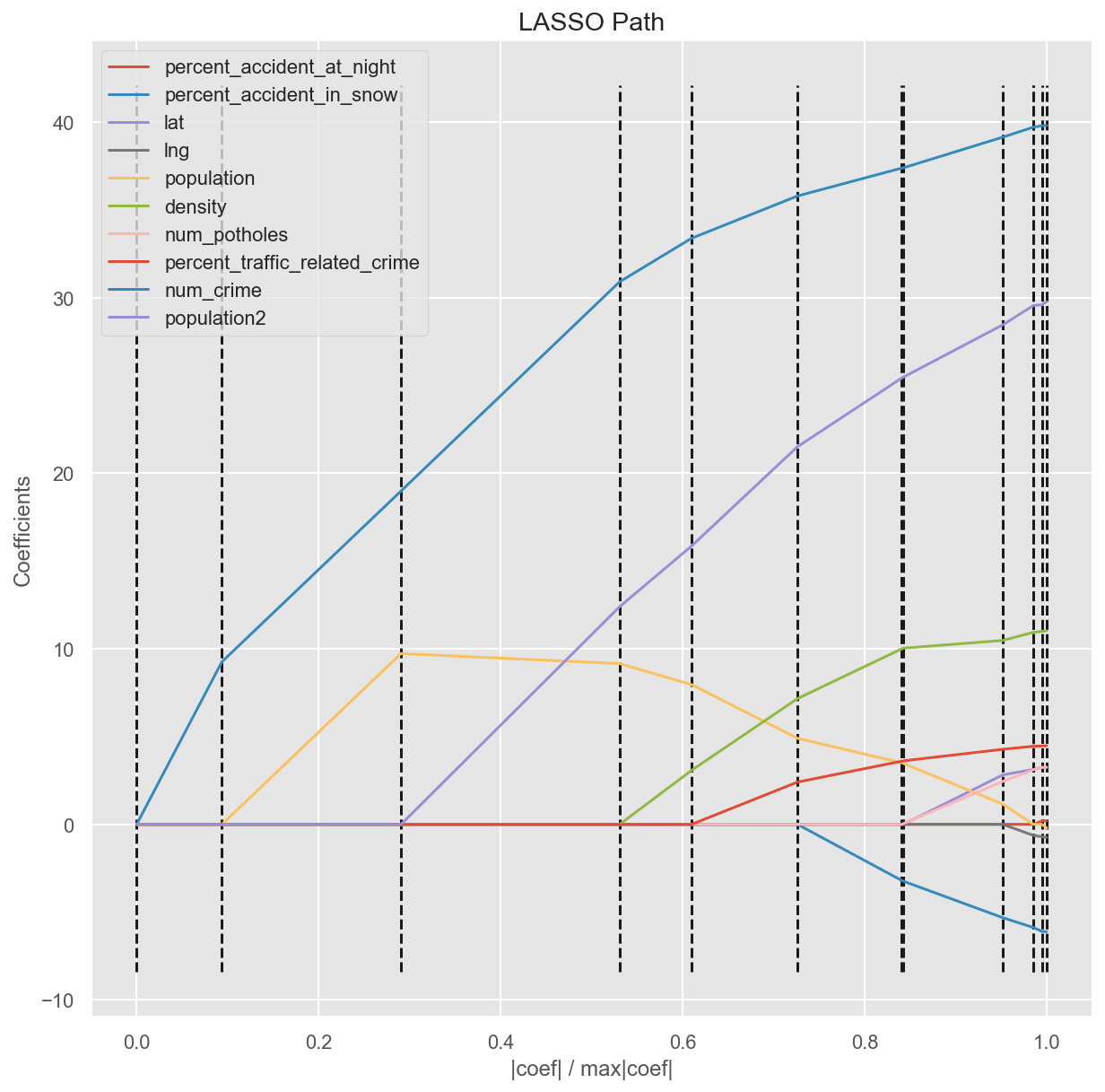
Find the most significant features with LARS model selection
LARS is a method for finding/computing the entire regularization path in a way that is nearly as computationally efficient as lasso because it shrinks the coefficients towards zero in a data-dependent way. Obviously, num_crime has the most positive effect on target num_accident
Predict number of accidents for zipcode 60616 (Chinatown and Armour Square)
# Predict car accident at zipcode 60616 in December
crash_id = X_test.index[10]

crash = df['id'].loc[crash_id]
zipcode, v = crash[0], crash[1]

predictions = model_fit.predict(sm.add_constant(X_test))

print(f'The actual number of accidents  at zipcode {zipcode : .0f} in {month : .0f} is {y_test.num_accident[crash_id] : .0f}')
print(f'The predicted number of accidents  at zipcode {zipcode1 : .0f} in {month : .0f} is {predictions[crash_id]: .0f}')
The actual number of accidents at zipcode  60616 in December is  187
The predicted number of accidents at zipcode  60616 in  December is  162
The predicted accidents in Chinatown during December is not too far from the actual one.
Conclusion
In this blog, I covered some methods to extract spatial data, cleaning and fitting the regression model to estimate the car crash based on the zipcode. There is much room for improvements.
-
Deploying different algorithms to improve $
R^2$ score and the accuracy of model. -
Adding more features such as ridesharing data or median income to figure out the affect of those new features on model.
-
Prediting car crash can also reduce the risk through enforcement, education.
You can find the project on Github and reach me out on Linkedin
Thank you for reading this article.
